Completion Year: 2021
Location: Guangzhou
Completion Year: 2021
Location: Guangzhou
紅蘋果家具-暖心陪伴消費者的貼心好友
Red Apple furniture - A warm companion to all
長期在板式家具領域耕耘的紅蘋果家具,在成立40周年之際著手進行品牌重塑與整體形象更新,在過去主打高品質產品的基礎上,強化創新、年輕、突破、人文關懷的訴求和暖心服務。今日,紅蘋果以「共造生活家,真添幸福感」的企業理念,將「成為消費者貼心好友」的精神貫徹至產線規劃、產品設計、商業營銷及展售空間的設計佈局中。紅蘋果家具相關的空間規劃透過其核心理念基因的注入,讓品牌價值及精神產生延伸連結,打破傳統空間設計單純從實用、堅固、美觀三項要素規劃的思維,而能進一步強化空間感知與品牌特質的連貫性與整體性。
Over the years, Red Apple has constantly pursued excellence in panel furniture, and with its 40th anniversary drawing near, modification and update of the brand image were initiated. The renewal focuses on building upon the foundation of high-quality products and emphasizing heartfelt innovation, youthfulness, progress, and culture. Today, Red Apple's corporate belief of becoming a warm companion to all can be seen in its production system, product design, marketing, and retail spaces. Furthermore, all affiliated spatial planning is implemented with these core values to extend the brand's essence. Thus, breaking away from the conventional interior design and starting from a simple mindset comprised of practicality, robustness, and aesthetics, accentuating spatial perception and the continuity and integrity of the brand identity.
以家為名-形塑「家」意象的分區展間設計
In the name of the home - An exhibit design shaping the essence of a home
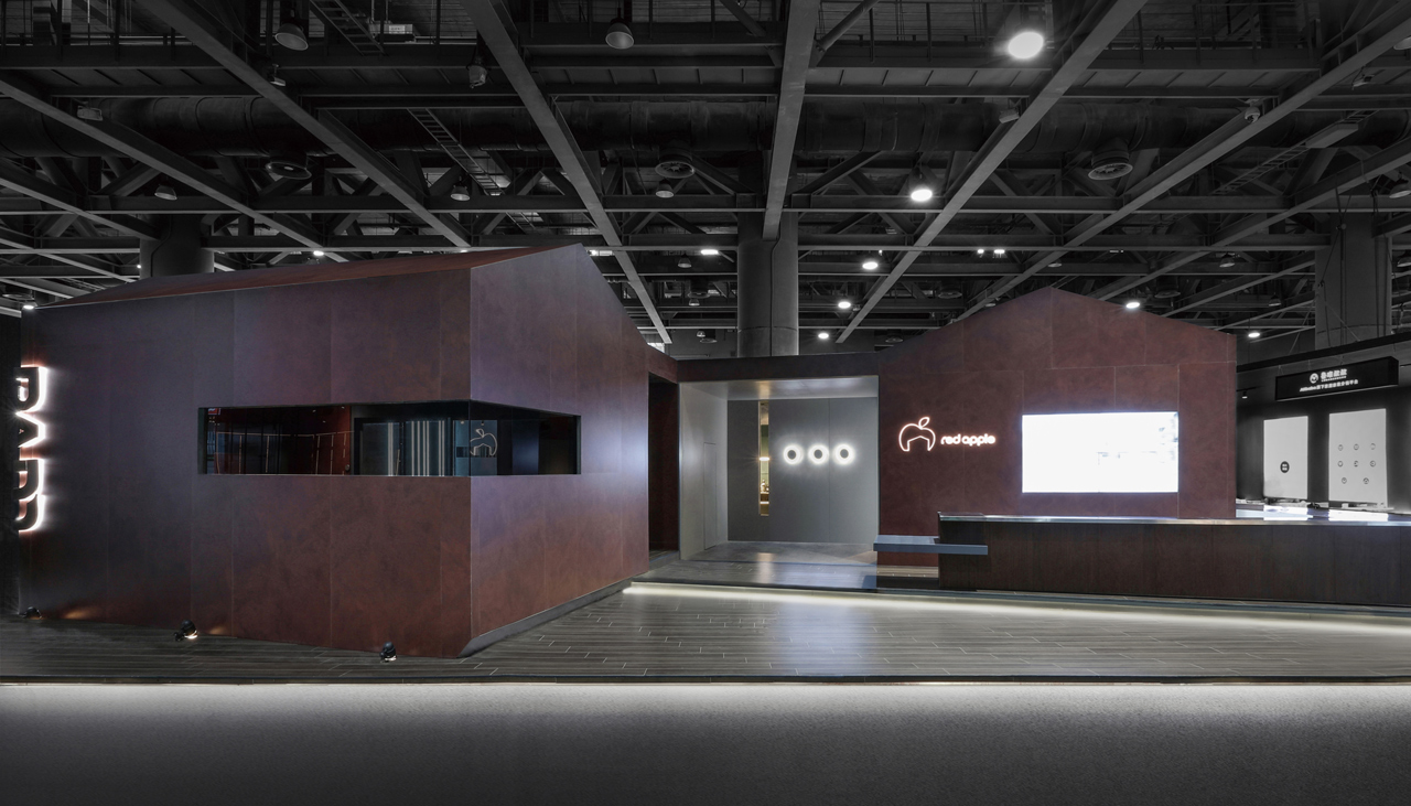
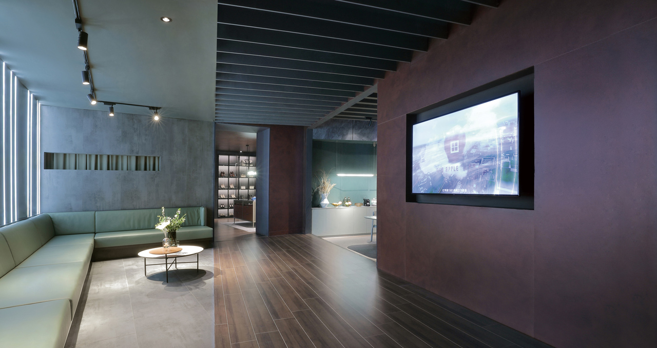
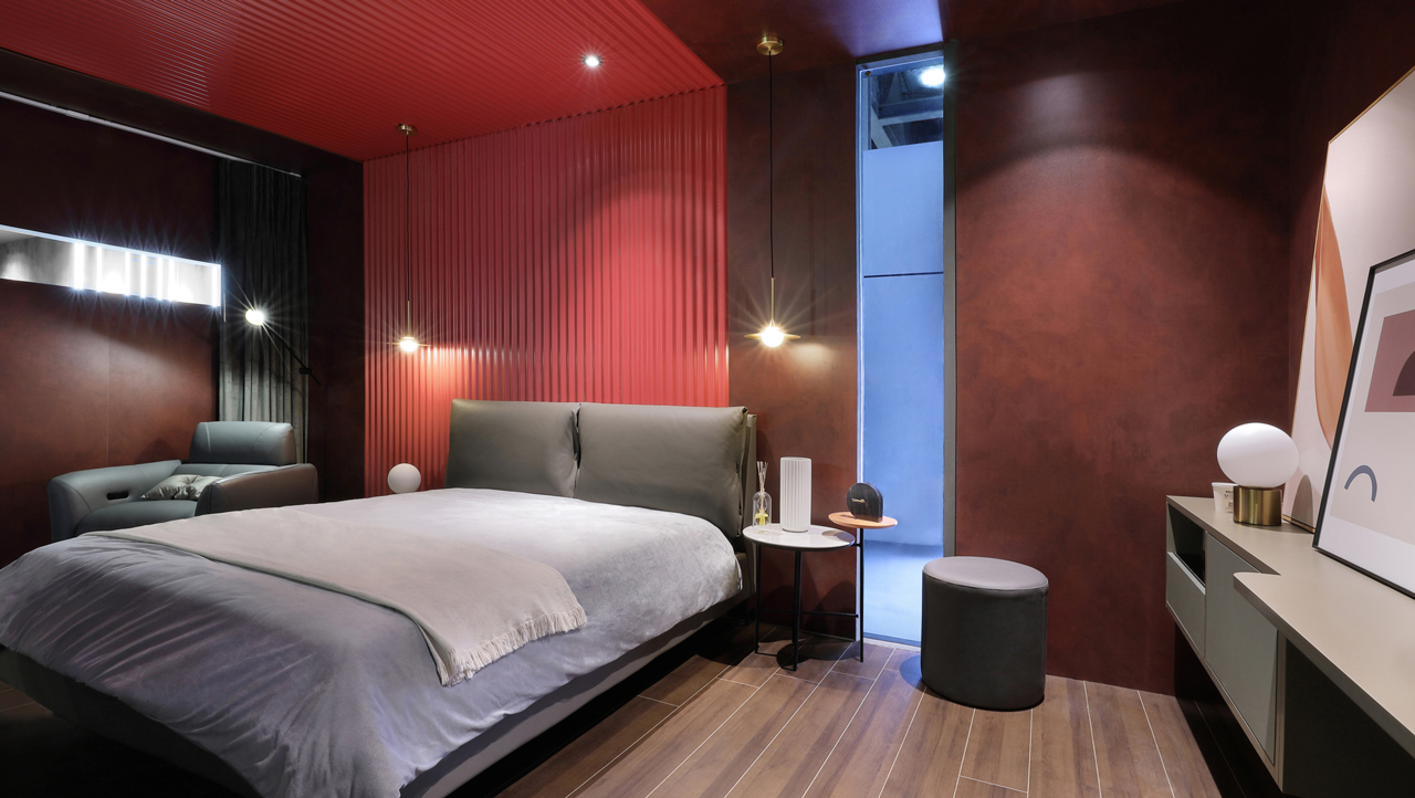
本次廣州建博會,紅蘋果擁有高定館與綜合館兩大展區,兩者形成各自獨立又互有關聯的展示樣態。高定館顧名思義即是展示高級(端)定製的家具商品,這些具個性化的產物,強調更為講究的材質用料、施工工法、接合細節與設計美感,它們亦需要一個得以彰顯上述特質並與之相襯的展覽空間。團隊在高定館採用品牌色真誠紅為主色調,再藉由深沉的赭紅色皮紋飾面材質,以不規則凹凸紋理的特有質感,強化訂製產品線的獨特性與高端氛圍。展館外觀亦連結全新的品牌識別標誌,在蘋果之下形塑「家」的造型理念,展現以山牆、斜屋頂等家屋元素發展的外型設計。
This year at the China International Building Decoration Fair in Guangzhou, Red Apple hosted two grand exhibition areas called the Premium and Scopic pavilions, creating an independent yet interconnected display style. The Premium Pavilion, as the name suggests, features sophisticated custom furniture. These distinctive products focus on materials, craftsmanship, adjoining details, and design aesthetics; as such, a corresponding presentation space is needed to accentuate these aspects. Therefore, the team incorporated the primary brand color of honest red as the dominant hue and a deep ochre red leather with irregular patterns to strengthen the refined individuality of the custom-made product line. The exterior design of the pavilion is also an extension of the redesigned brand logo, expanding housing elements of slanted roofs and gables from the concept of reshaping the home within the apple.
凝聚內核-圍合概念之下的新生活場景
Core agglomeration - New scenes of life under an encompassing concept
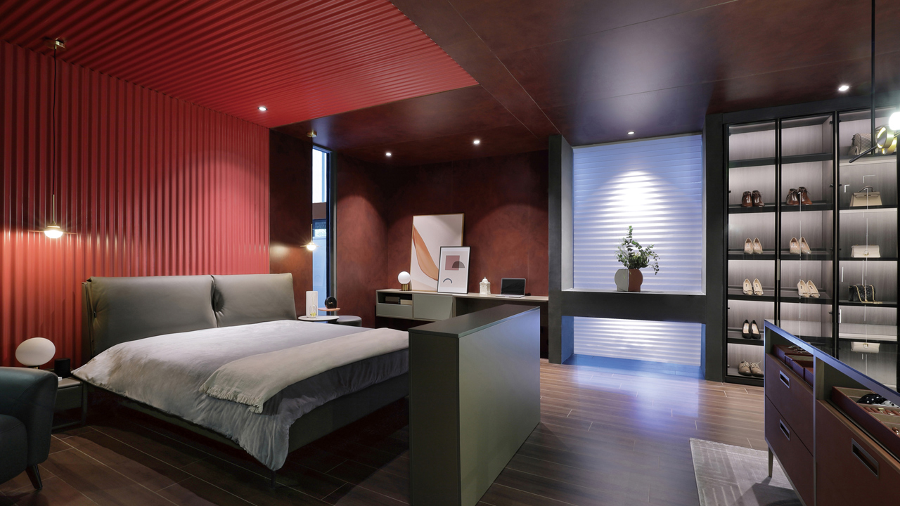
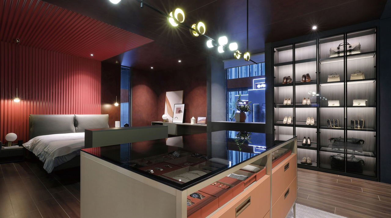
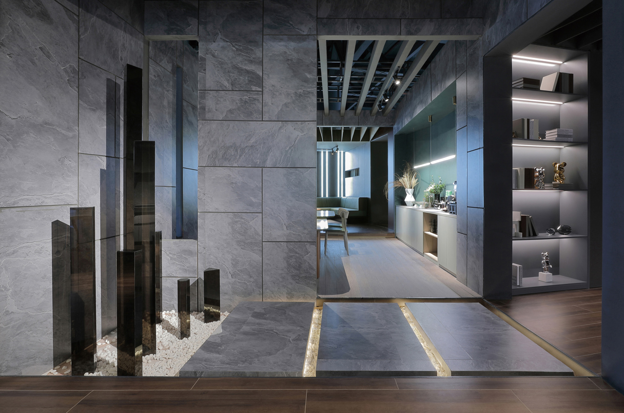
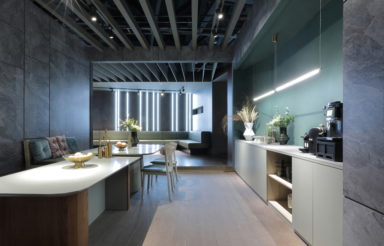
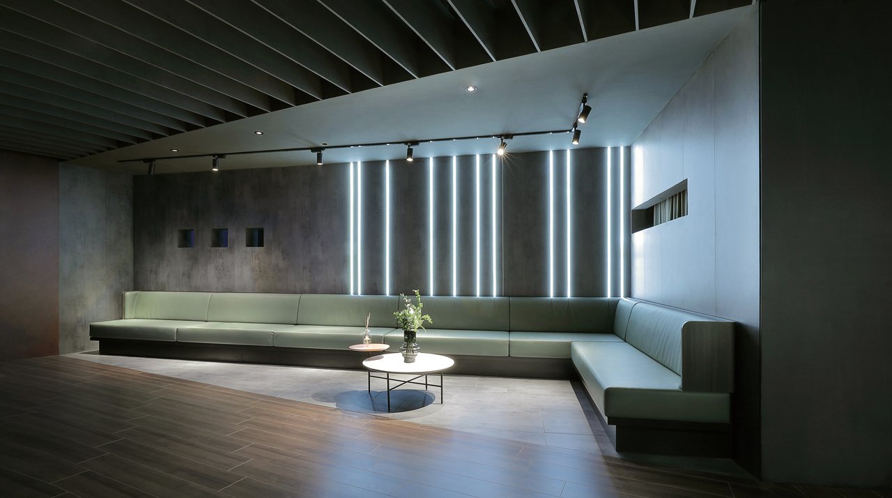
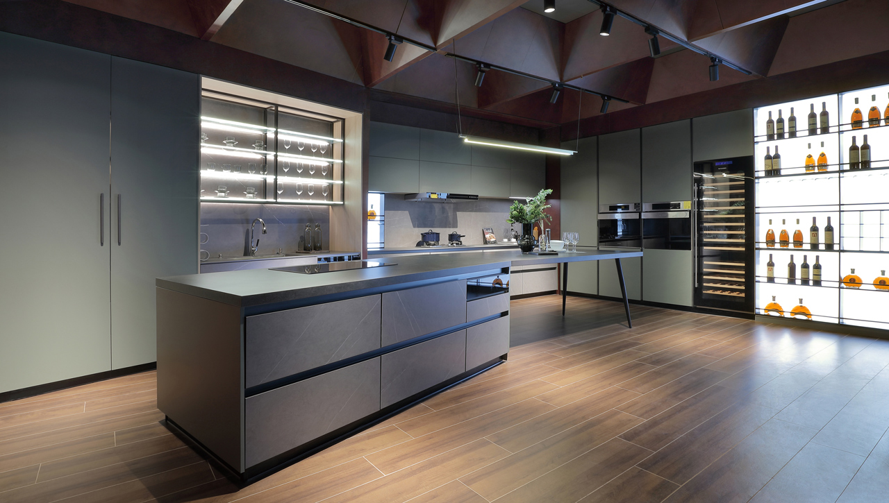
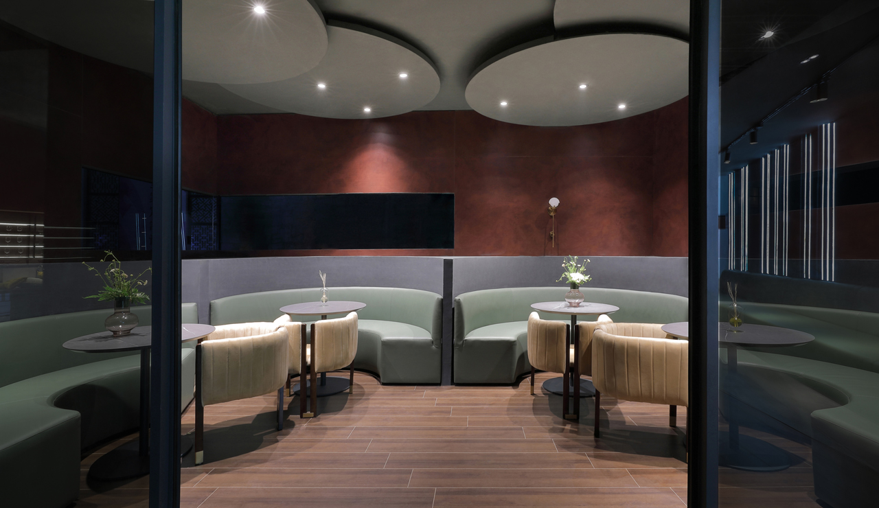
延續以「家」為造型的外觀,展廳內部規劃亦從「家的想像」出發,以圍合概念連結居家生活空間布局,展現人們對家最基礎、最直觀的印象。由真誠紅與赭紅色系打造的暗色展間,加諸以莫蘭迪色系的低彩度家具與隱藏式間接照明,建構低調、輕奢的空間質感。團隊亦整合隸屬服務性的前台、廣場、休閒區及文化走廊,與屬於展示性質的客廳、餐廳、廚房、臥室、衣帽間等居家場域,分別散置在展區四周,整體再以環形動線的設計安排,將不同的區域串聯一氣,進而建構空間的凝聚性。藉由此種圍合聚居的布局模式,參訪者得以在服務性空間與不同展區之間來回穿梭,心境也隨之轉換,創造家居展間與品牌精神的深度關聯。
Extending from the form of the "house," the exhibit interior planning also stems from the vision of a home. Using a circular concept that connects the various living areas to present an intuitive and fundamental home impression to visitors. The subtle and elegant space comprises mainly of honest and ochre red with Morandi-hued furniture and indirect lighting. The team also integrated the service-oriented sections of the counter, square, rest area, and culture corridor with the display-oriented regions of the living room, dining room, kitchen, bedroom, and cloakroom. Thus, the different areas are spread throughout the exhibit and linked together with a circular flow of space to create spatial cohesion. Through this encompassing layout, visitors can experience various atmospheres as they weave in and out between service and display spaces and forge a deep connection towards the brand and its products.