品牌簡介/企業 Logo
Brand Introduction / Logo
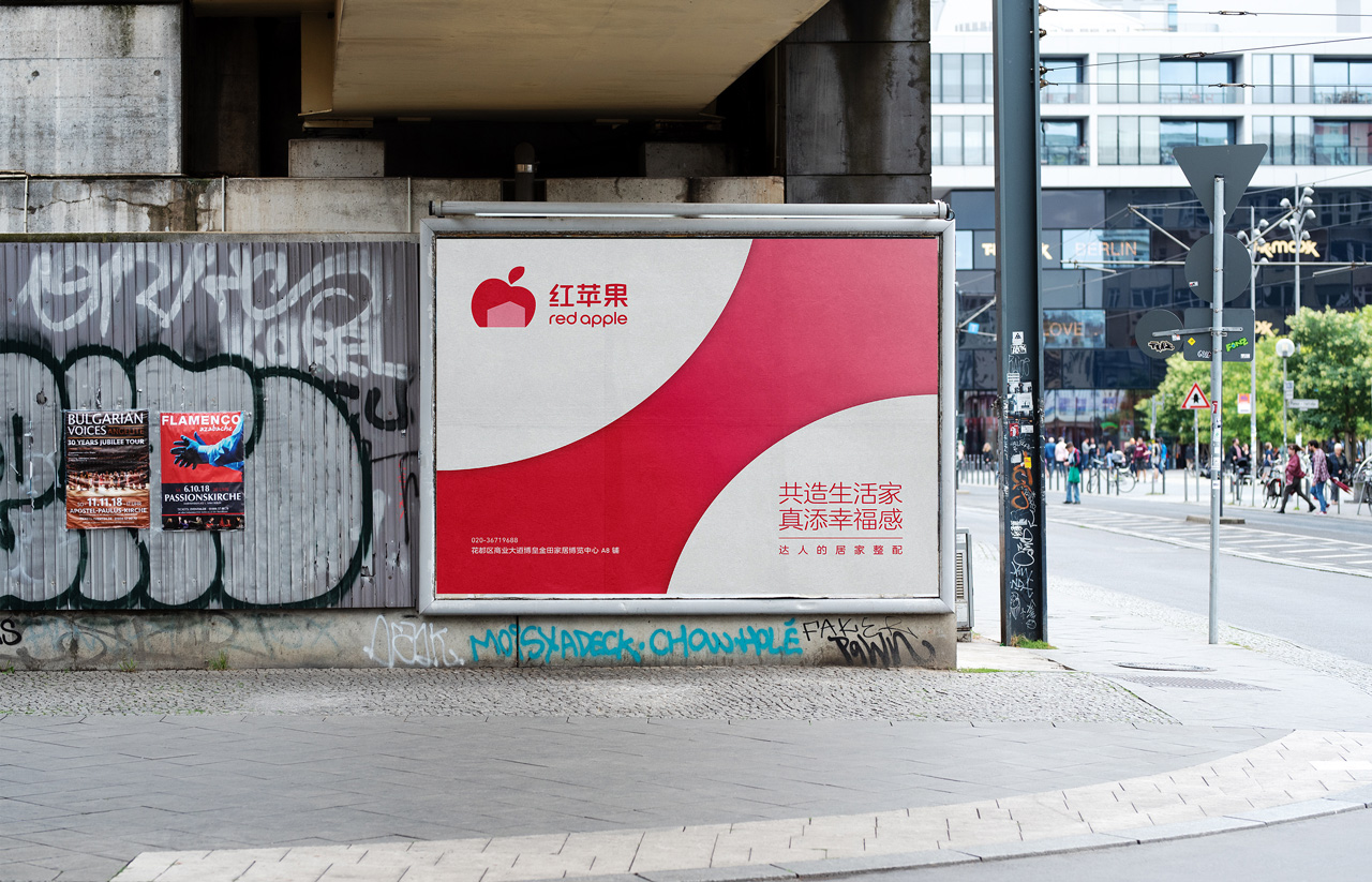
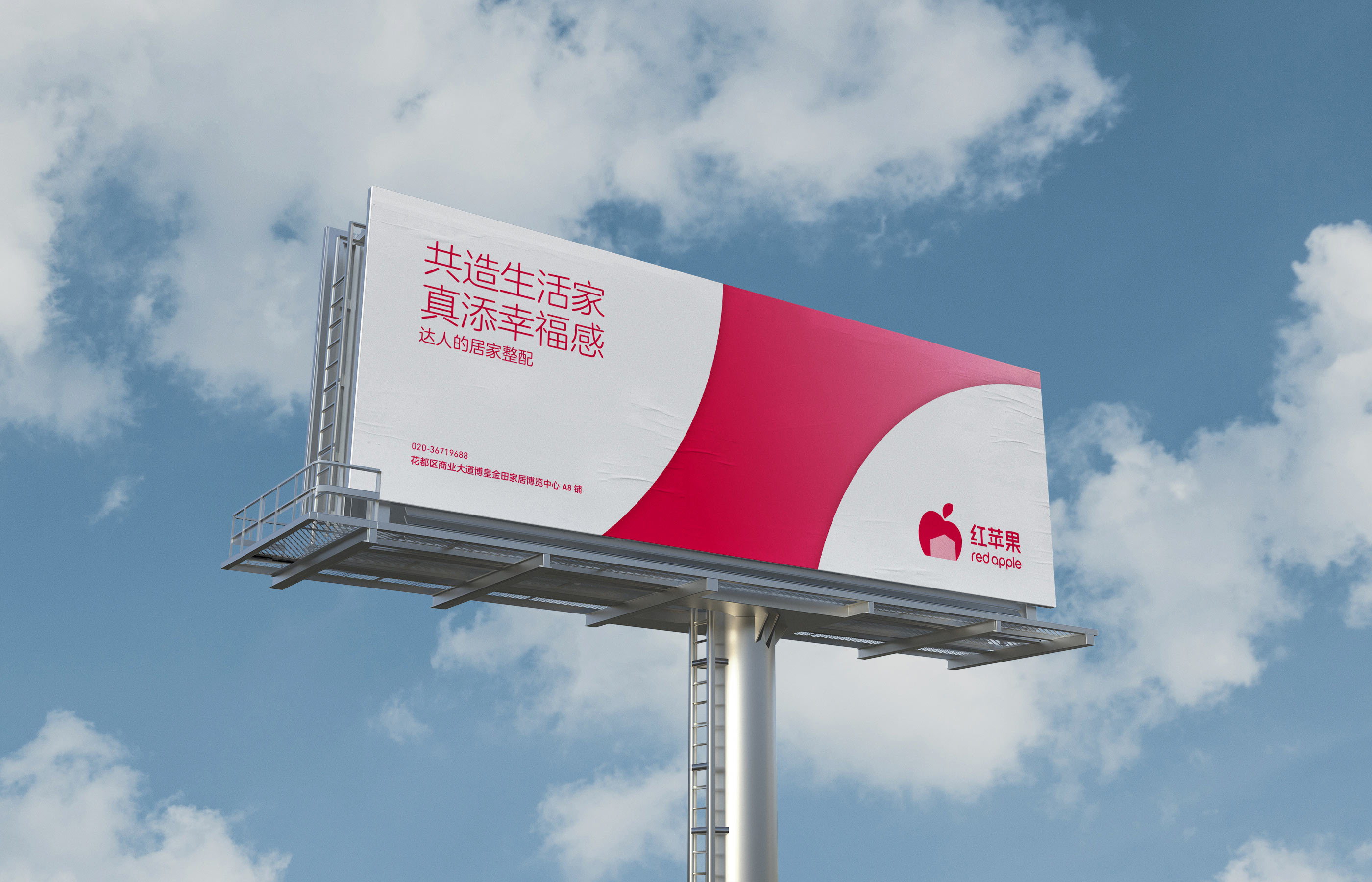
Red Apple 7i 紅蘋果家居品牌識別設計
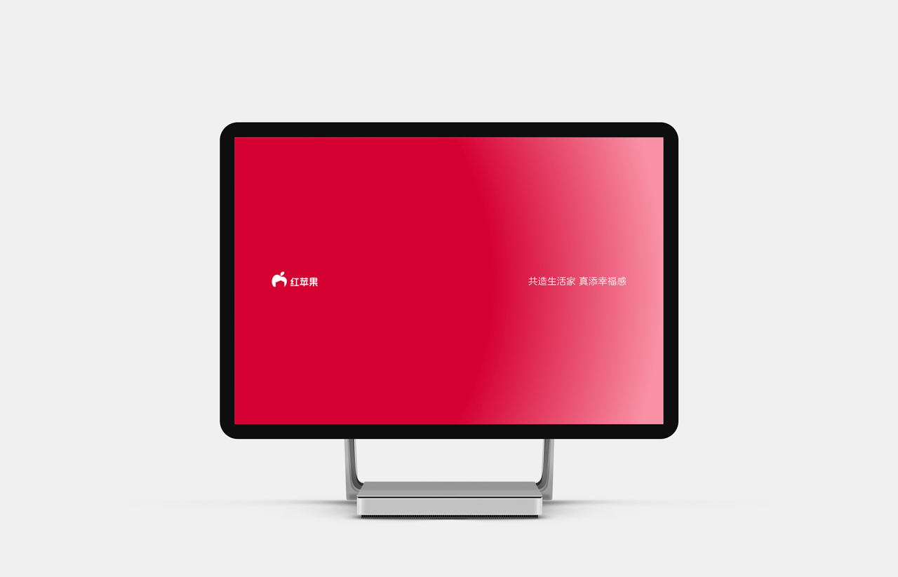
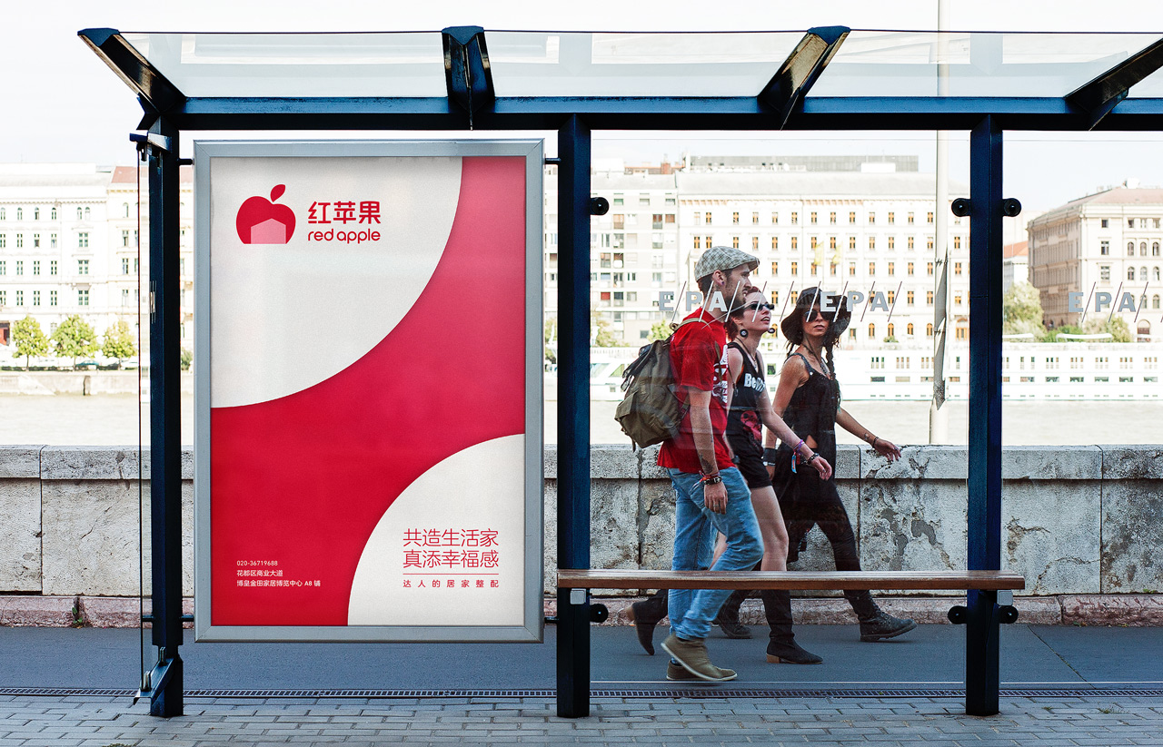
共造生活家.增添幸福感
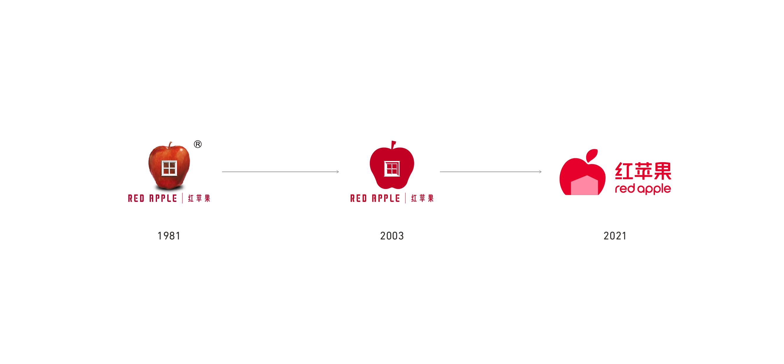
「沒有永遠年輕的品牌,但消費者永遠年輕」,擁有40年歷史的紅蘋果是集結產品研發、生產、營銷、服務於一體的家具品牌,長期以高品質、設計感、強調環保等特質贏得廣大消費者的認同。近年面對品牌年輕化的轉型需求,團隊以「想重新再認識你一次」為概念進行品牌設計系統(5I)的年輕化提案,透過更當代、更扁平的視覺語言重塑品牌標誌,延續過去「紅蘋果+家」的意象元素並加以轉化、調整,以此擘劃企業充滿自信的蛻變轉捩點。
"There's no such thing as an eternally youthful brand, but consumers are always youthful." With 4 decades of product development, manufacturing, sales, and service experience, Red Apple manifests itself as a brand that holds quality, design aesthetics, and environmental issues in high regard. In turn, they have gained the recognition of consumers far and wide. Faced with a growing need to revamp the brand itself to a new era, we came together to produce a branding system (5i) with the goal of "getting to know you again" in mind. The brand logo is reborn through a modern, streamlined approach, with the past concept of "Red Apple + home" transformed and adjusted to mark the bold transition of this corporation.
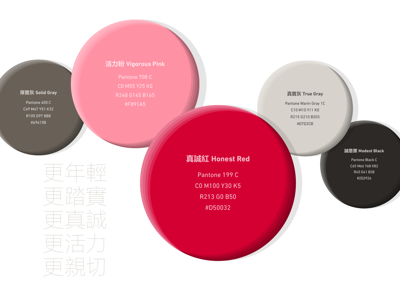
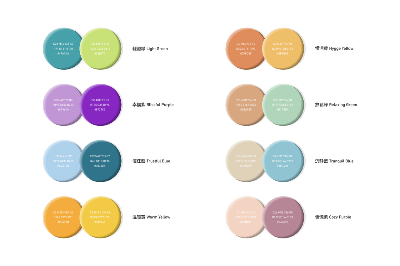
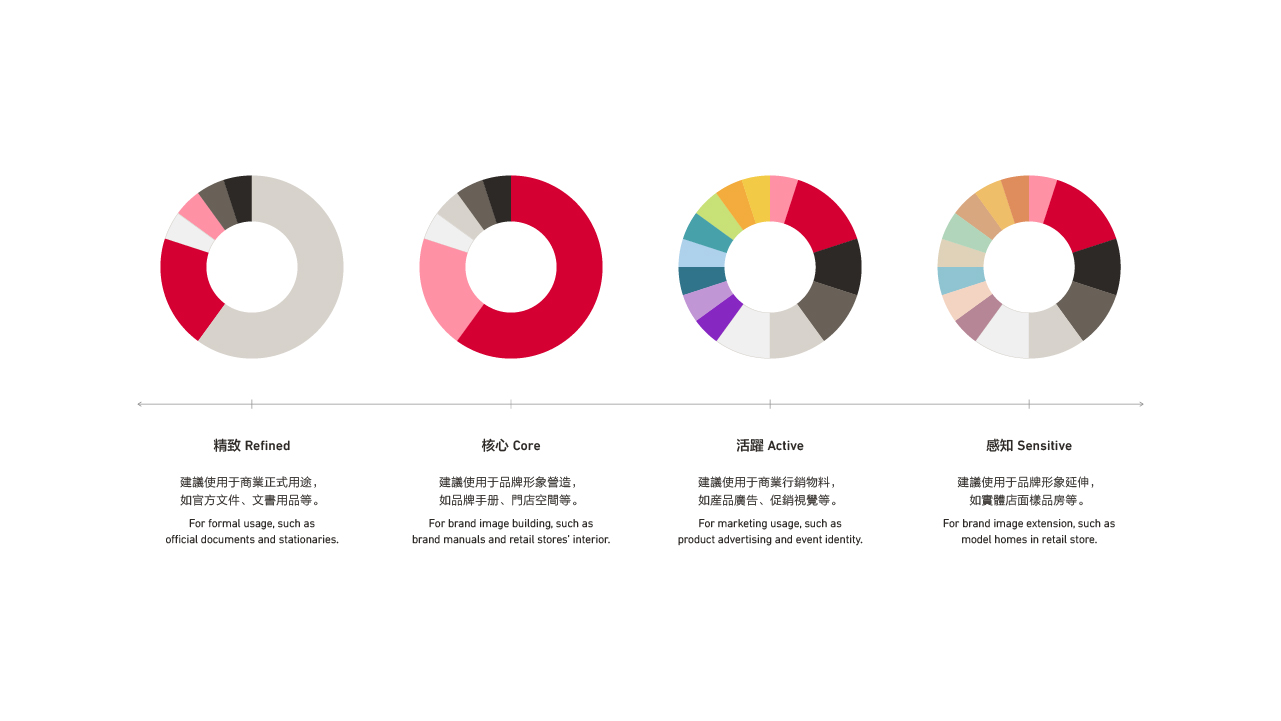
企業色彩
Color Scheme
品牌標準色為視覺識別中的一項重要元素,紅蘋果以真誠紅、活力粉及暖灰階作為色彩主旋律,藉此深化企業既有的紅色調印象。「紅中藏粉」的色彩巧思象徵產品在內斂中追求循序漸進的升級,同時展現更青春、活力的樣貌予世人。在輔助色的部分,團隊亦針對未來潛在應用的各種可能性,設計精緻、核心、躍動、感知等四款色彩搭配的視覺引導,透過不同的色彩比例搭配,滿足在虛擬線上、實體線下及各式場合的視覺整體性。
The primary color plays a crucial part in cultivating the visual identity. For Red Apple, Honest Red, Vigorous pink, and warm tones grey make up its primary hues to revitalize its existing crimson visuals. Furthermore, concealing pink inside red portrays the beliefs of striving for progress within its products' subtle exteriors while unveiling its youthful energy to the world. In terms of the secondary colors, we created four hues with the characteristics of exquisiteness, core, vibrance, and perception per potential usage in the future. The tandem use and collocation of the four-color sets act as a visual guide that fulfills the visual integrity in both virtual and physical scenarios.
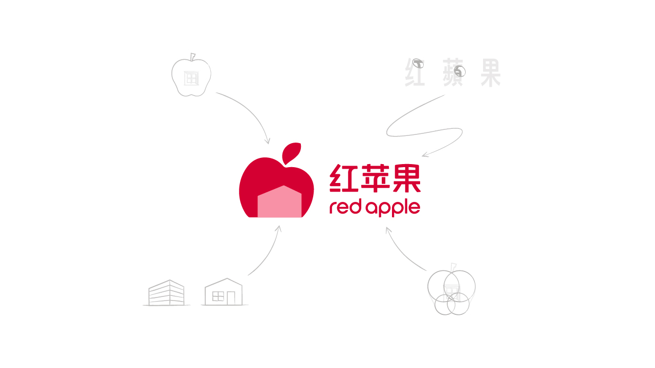
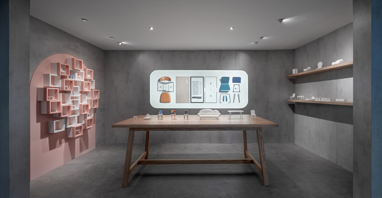
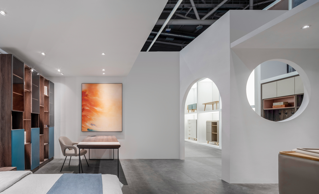
輔助圖形
Pattern
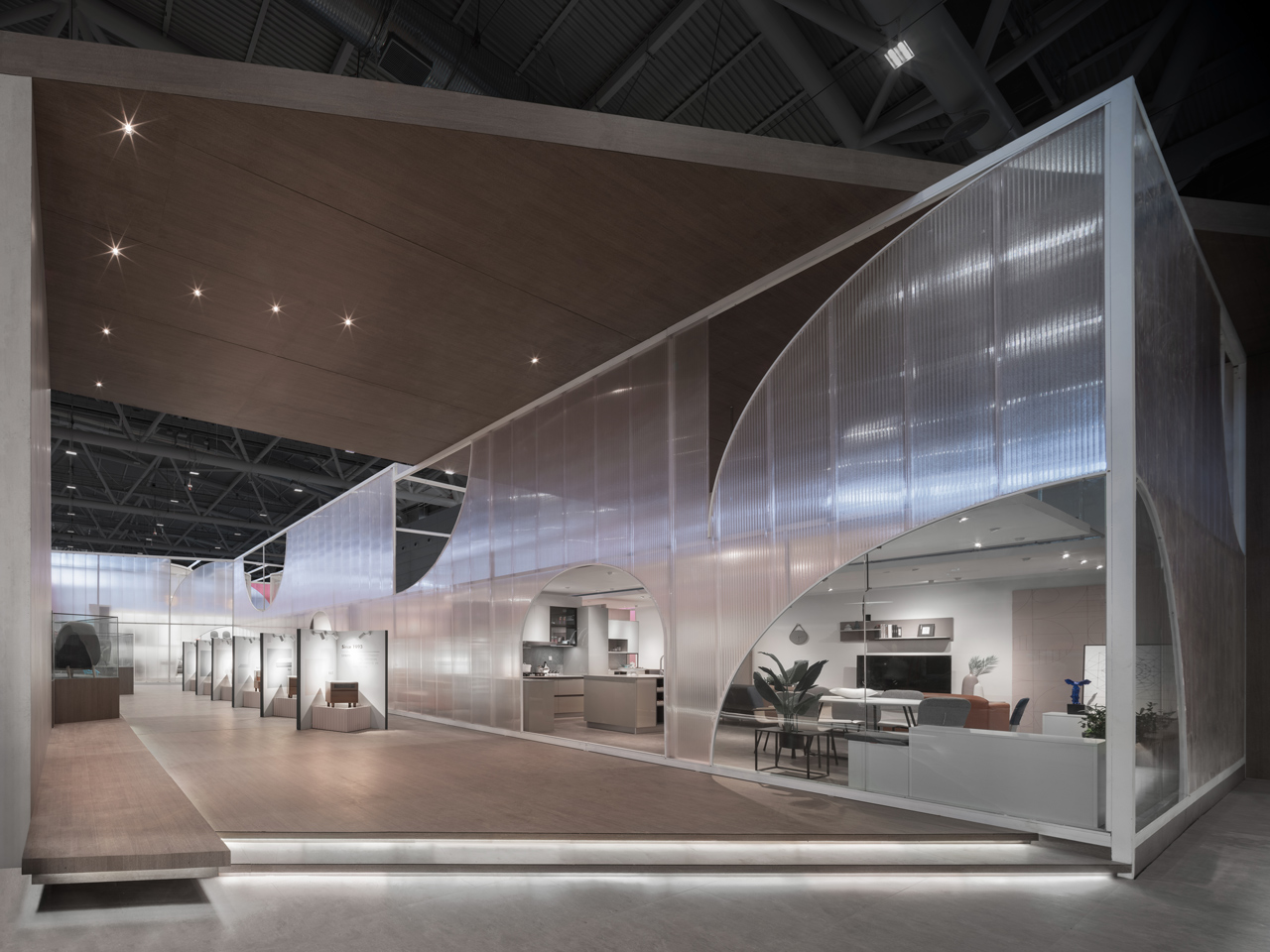
輔助圖形沿用品牌標誌中的四大重要意象元素:房屋造型、蘋果屋標誌、漸層色彩變化、曲線,透過品牌元素的轉譯與詮釋,廣泛應用於印刷品、數位圖像、門市空間、多媒體等視覺呈現中。透過在尺度與色系上保有一體性與秩序性的輔助圖形,無論在線上或線下管道,皆能快速地在商業市場中傳遞紅蘋果年輕、踏實、真誠,充滿活力的品牌形象。
The patterns derive from four significant elements of the logomark, which are: the house-shaped symbol, apple house mark, gradient hues, and curves. These features are translated and implemented throughout printed matter, digital images, showroom spaces, and multi-media outlets. By maintaining the unanimity of scale and color of these patterns, the youthful, steadfast, authentic, and lively image of Red Apple's brand can be expanded swiftly throughout digital and physical channels.
品牌吉祥物
Brand IP
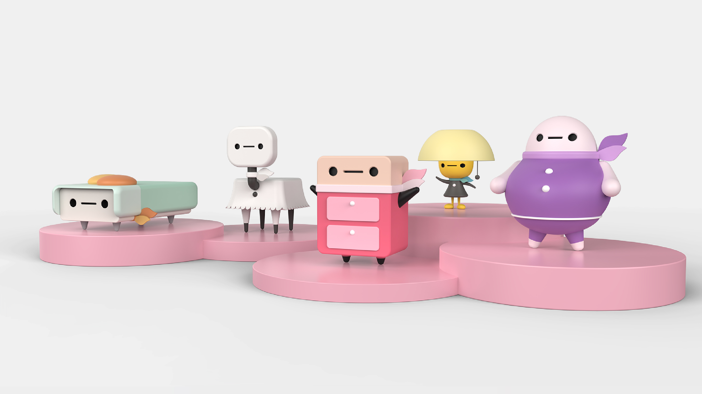
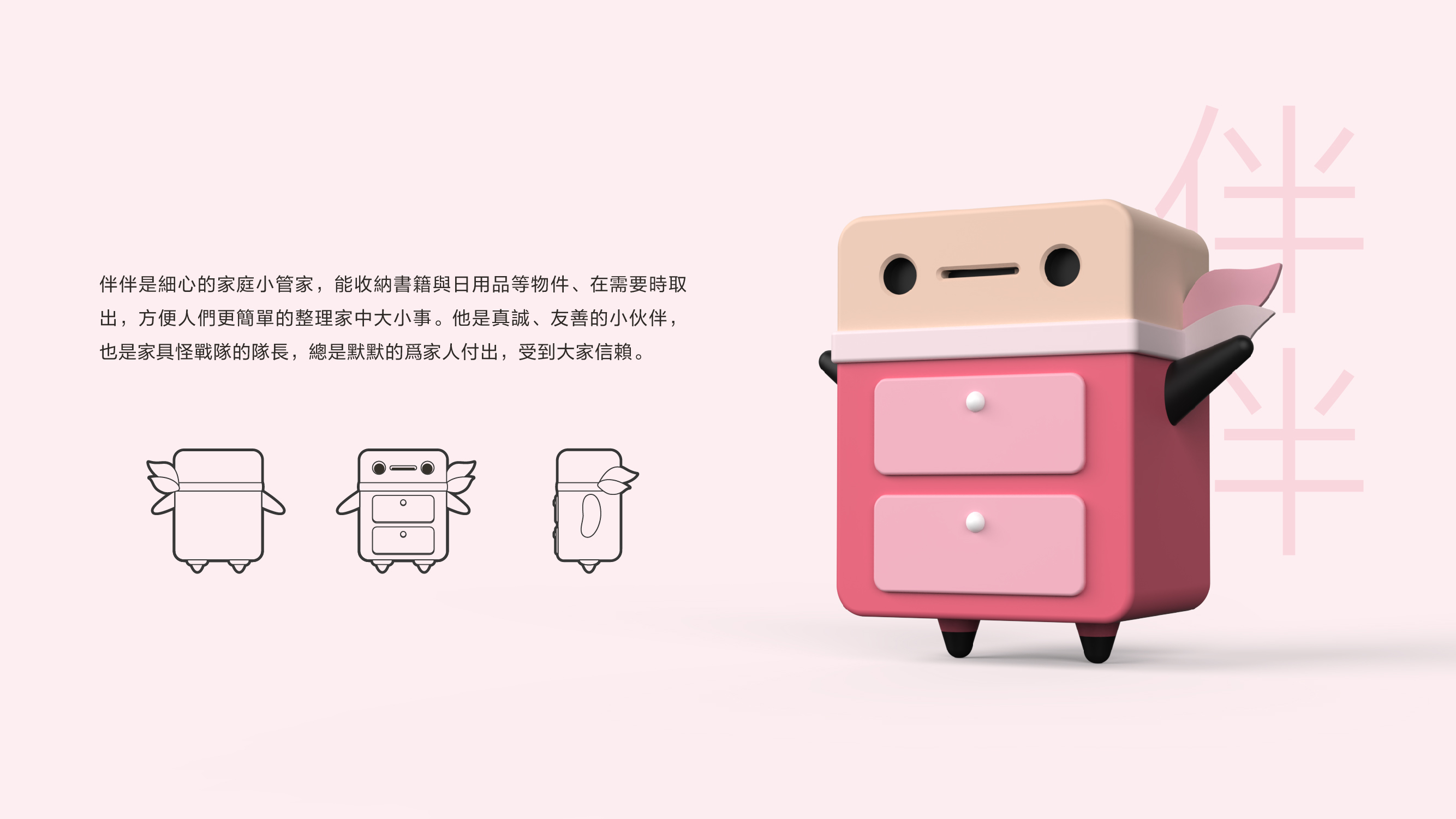
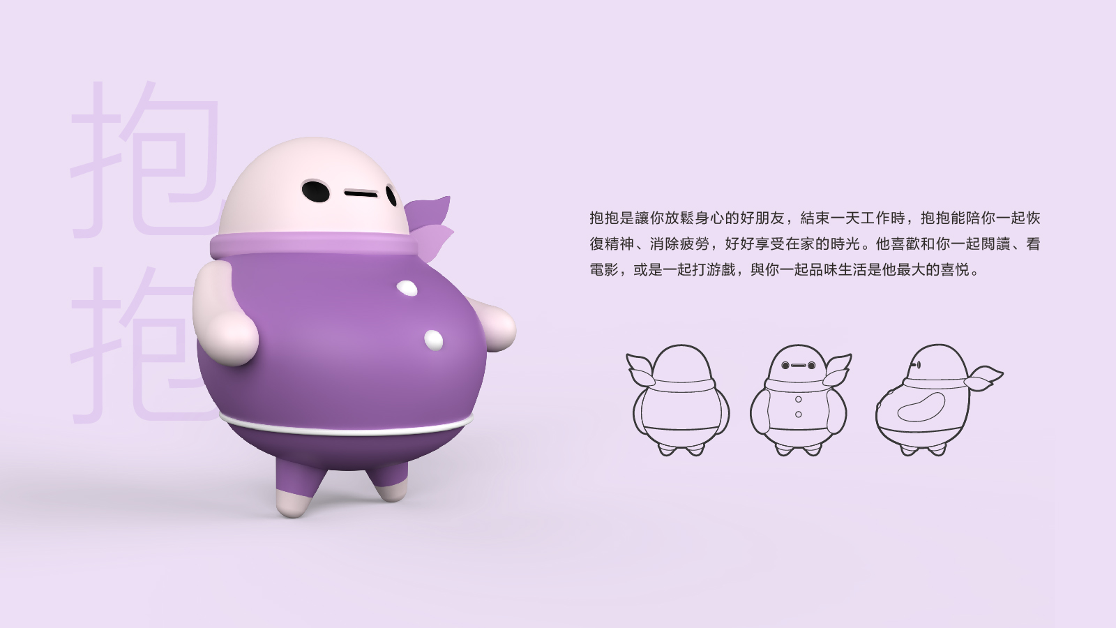
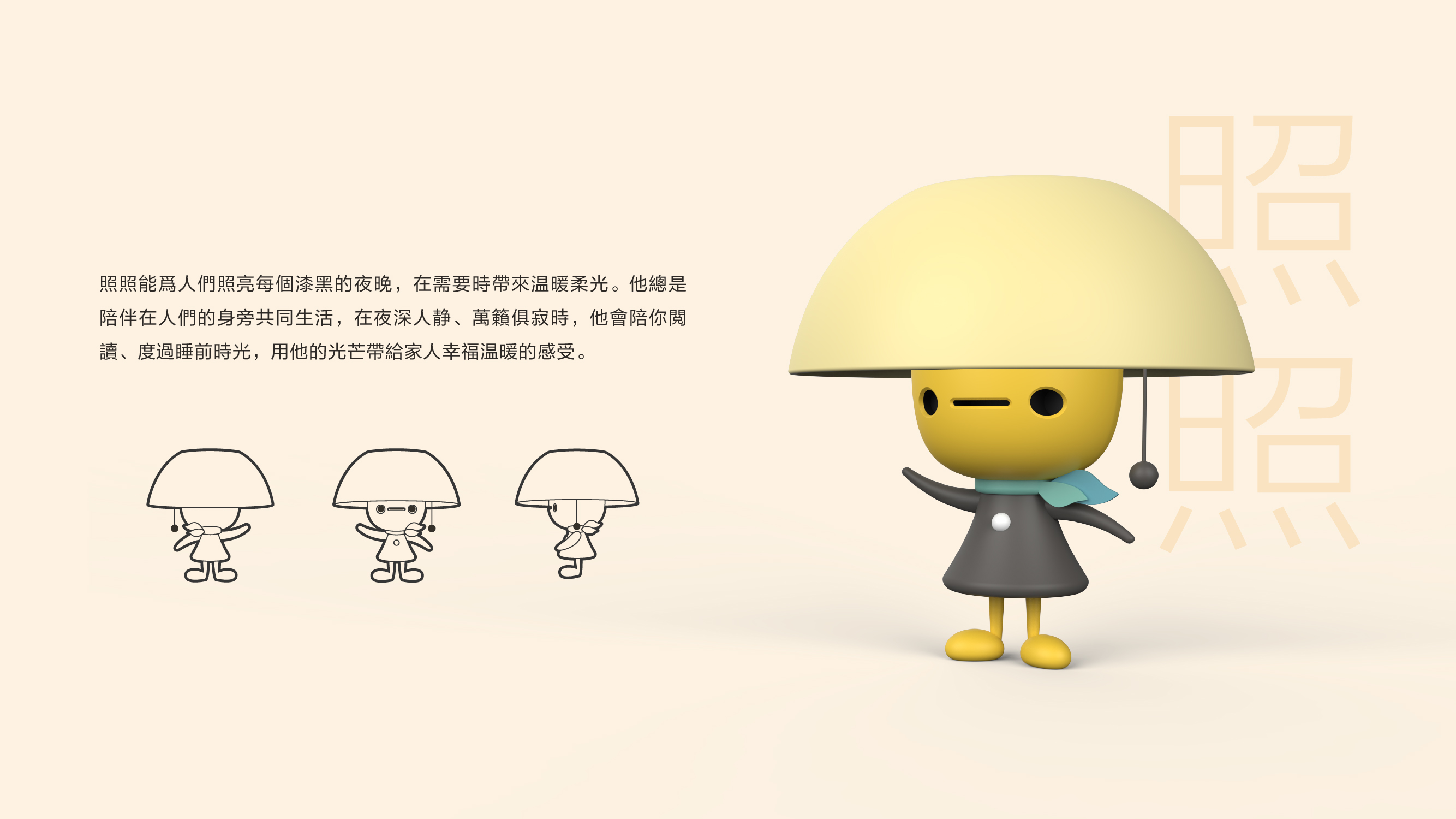
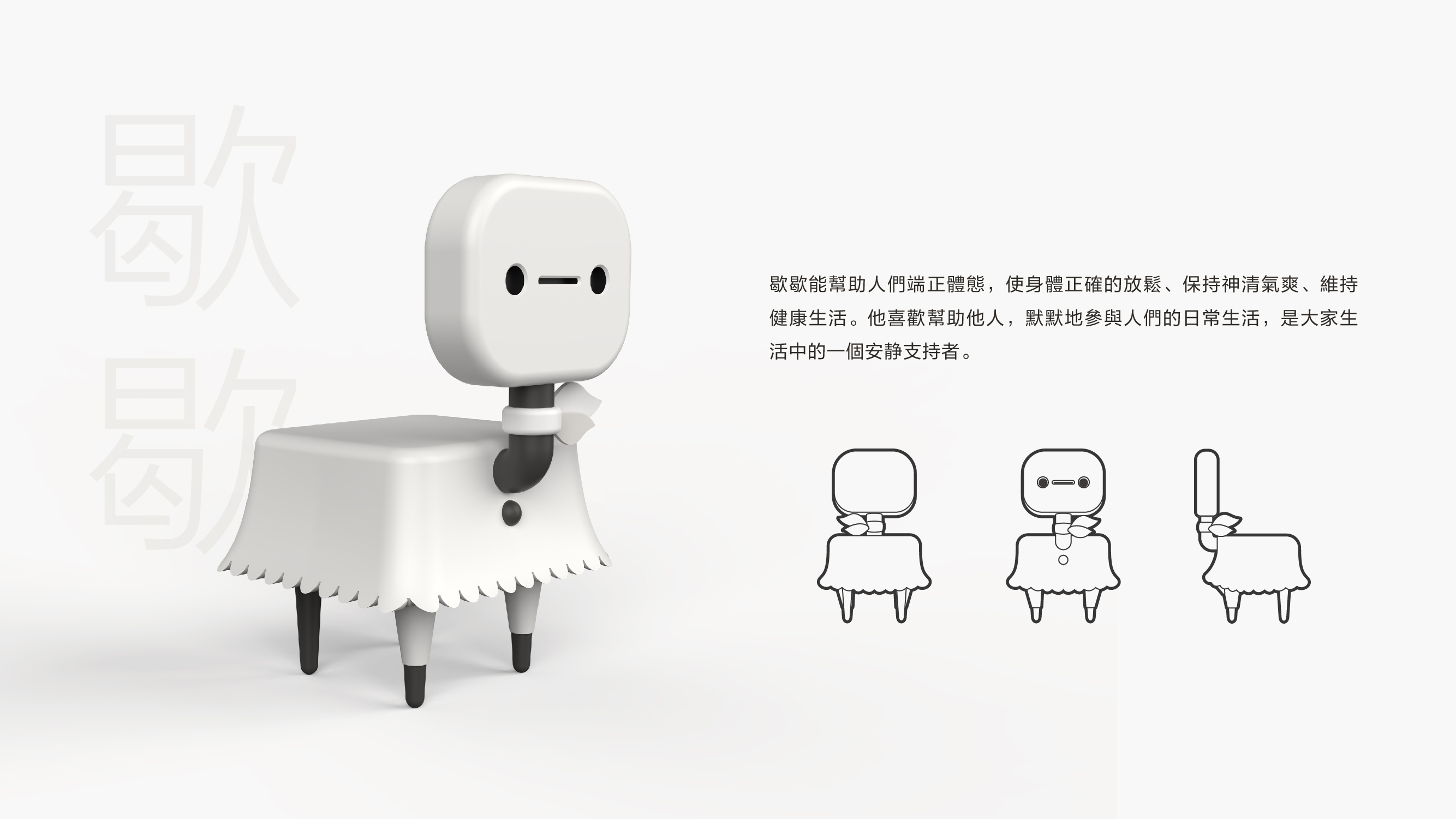
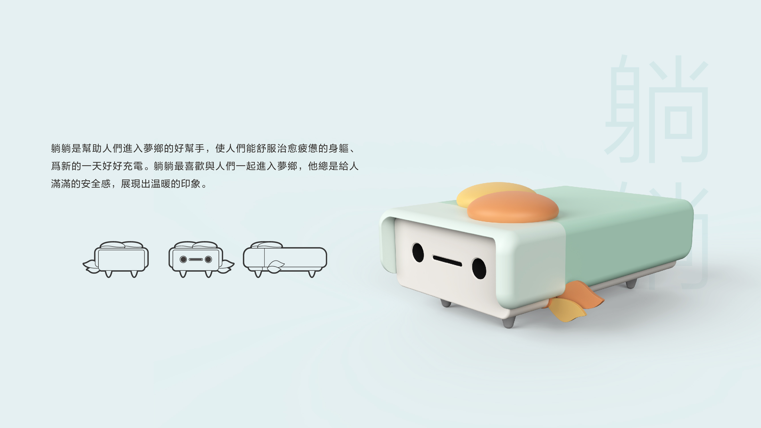
紅蘋果「陪伴你生活的好朋友」特質延伸至品牌KOL,標榜溫暖、真誠、友善的家具戰隊應運而生。由五隻外型、特質各異的二次元吉祥物組成的家族,分別以床頭櫃、燈飾、沙發、座椅、床等五種常見的家具轉化而成,角色個性回應家具既有特質,結合品牌輔助色後轉化為真實的人物形象,透過品牌虛擬代言人的設定,既可拓展品牌形象泛用性,同時也能觸及更多潛在的新世代消費族群。
Red Apple's spirit of "Your good companion in life" is extended to the brand's KOL. From those values, a squad exhibiting warmth, honesty, and camaraderie is conceived. The team is comprised of five characters that vary in design and traits, which include forms derived from a bedside cabinet, a lamp, a sofa, a chair, and a bed. The personality of characters reflects the attributes of their respective furniture and is also combined with the secondary to create original personas. Through these virtual brand spokesperson, the brand image's versatility is increased, expanding to an ever-growing pool of new-age consumers.
藝術總監 Art Director
邵唯晏 Alfie Shao
陳宛瑄 Mia Chen
-
專案管理 Project Managers
陳宛瑄 Mia Chen
邵子曦 Zixi Shao
-
專案團隊 Project Team
專責主案 Lead Designer :孫廷睿 Memphis Sun
平面設計 Graphic Design :孫廷睿 Memphis Sun、林宛瑜 Megan Lin
概念發展 Concept Development:林宛瑜 Megan Lin、蘇聖文 Adam Su
文本撰寫 Copywriting :蘇聖文 Adam Su
動態設計 Motion Graphic :許恩溥 Enpu Hsu
KOL 設計 Character Design :許恩溥 Enpu Hsu、陳皜曄 Jason Chen
-
業主 Client
紅創家居(深圳)有限公司 RADD (Shenzhen) Furnitures Limited
年份 Year:2021